Hidden :: Display
Maria Anwander und Ruben Aubrecht, Bernhard Kathan, Bernd Oppl, Steinbrener/Dempf & Huber
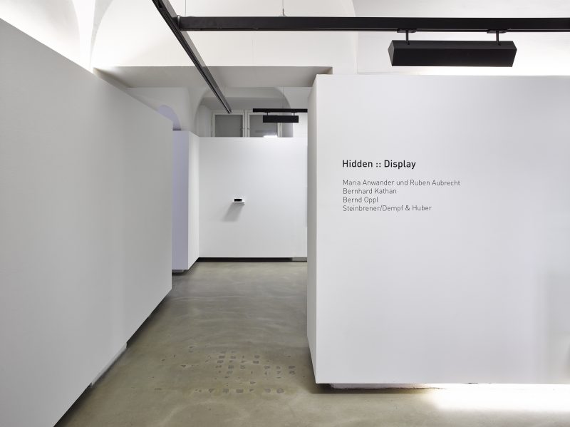
Hidden :: Display
Maria Anwander und Ruben Aubrecht, Bernhard Kathan, Bernd Oppl, Steinbrener/Dempf & Huber
Curated by Ingeborg Erhart
Hidden :: Display questions strategies of display. The theme of exhibiting is particularly ambivalent when those pieces being shown are works/content focusing on absence, deletions and omissions. Institutional criticism, the relations between work, setting and viewers, large-format dioramas that counter disappearance with excess, as well as products of silence are presented for debate here.
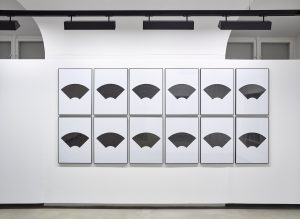
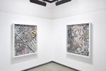
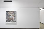
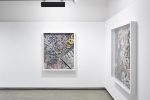
“The art of our time is noisy with appeals for silence.” Bernhard Kathan begins his essay Stille (Silence), Innsbruck 2012, with this quotation from author and cultural critic Susan Sontag. For many years now, he has been running a Hidden Museum in Fraxern, Vorarlberg. There, over four weeks in 2012, he offered potential visitors an opportunity to engage, entirely on their own, with emptiness and silence. Despite public advertisements and positive feedback such as, “I would love some real quiet, not hearing anything at all,” no one took up his invitation and Bernhard Kathan adopted the role of the recipient alone, exposing himself to silence for the full project period. Paradoxically, it gave him earache. As a “side effect” of this (in-)activity he produced six sheets of work, onto which he packed Kafka’s story The Burrow graphically and in such concentrated form that all we can see are flashes of isolated letters. Associations with ultrasound images or of the skies at night make clear the ambivalence of the theme. Most of the remaining printed letters form sibilant sounds. Those who know that the graphics are based on The Burrow–the story’s protagonist is an unspecified animal that becomes utterly crazy because of inexplicable noises in its system of defensive tunnels–will perhaps also feel disquiet at the feeling of inescapability. One of the less legible text fragments is: “Deep silence: how lovely it is here”. Reconciliation? Does silence ensure that things remain “open”? Open to individual associations… Does one encounter the “ghosts of one’s own expectations”[1]?. For the exhibition Hidden :: Display Bernhard Kathan has written the text “Nichts und Stille. Arbeiten mit Leerstellen”, which is available as a small, compact publication to take away free of charge.
Steinbrener / Dempf & Huber
Dioramas and their opulence seem to provide a counterpoint to Kathan’s (self-)experimental set-up. Of course, first someone or something must have appeared in order to disappear. The central theme for the trio of artists is plumbing the relations between nature and culture and the peep box-like collages arranged in several layers deal with the disappearance of fauna and flora due to construction measures such as river regulation. The work conceived as a diptych, San Francisco 1 and 2, has three layers, which interlock as narrative levels: an aerial image from the 1930s showing the docks and Down Town of San Francisco, historic map material on the (as yet) unregulated Mississippi, and “true to nature” illustrations of snakes from the hand-tinted thesaurus Das Naturalienkabinett by Albertus Seba, dating from the 18th century. Besides the displacement of the natural landscape by civilization, it is also about questioning views and representations of the world. The fictional and the mythical are combined with the natural image. Is it probable that snakes with stripes lengthways ever existed? Where early natural historical research revealed gaps, other sources or even the imagination provided the material to fill them. Concentration is a strategy that Steinbrener / Dempf and Huber have been pursuing since the start of their cooperation. Their project Delete! supposedly liberated an entire street in Vienna from any form of signage in 2005. But due to the signal yellow coverings used, the mass of written information was not deleted but made over-obvious.
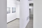
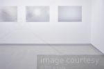
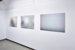
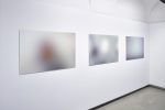
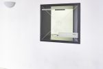
The works of Maria Anwander and Ruben Aubrecht could also be read as a reaction to the flood of images to which our infomation society is exposed. Questions about authorship and the logics of utilization are involved, as well as strategies of appropriation. Picture agencies produce so-called stock photos to keep in reserve, which can be acquired to convey visually the broadest spectrum of content. A series was produced under the title Stockfotos and the photo work Captivated by a Masterpiece (gettyimages) belongs to this series; to create it, the artist duo used filters to process a photo showing two women looking at art for so long that the motif and the logo of the picture archive, which makes its usage without a licence impossible, could no longer be seen. Ironically, the works by Anwander and Aubrecht made in this way are aesthetically pleasing as blurred, abstract images. Image Courtesy is the title of a work represented in two variations in the exhibition. A ©-protection motif is printed onto transparent textile material, so crossing out the image behind, and the utilization rights are indicated with the icon of a photo camera. Because “Image Courtesy Maria Anwander and Ruben Aubrecht” is also written on it, it seems that the artists have appropriated everything which is visible behind the curtain. Does this mean–since the same motif is fixed to the window pane of the gallery using adhesive foil–that Anwander and Aubrecht lay claim to the entire gallery space, and possibly even to the people going in and out?
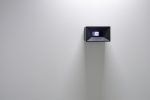
Bernd Oppl’s Screening Room reflects an exhibition setting that has now become a classic. A black peep-box shows a room also kept black, in which there is nothing more than a simple bench produced using a 3-D printing process, set in front of a picture or rather projection area. The viewers are compelled to move very close to the object in order to grasp the situation in the miniature exhibition space. A few seconds later they themselves appear on the display of the Screening Room, which is simultaneously observing the Neue Galerie. Bernd Oppl creates works that go far beyond mere “machines for seeing”, that is, optical devices that reflect upon perception as a visual primacy, and questions of display in the sense of the relationship work/display/recipient/institution. The body is involved as well as the viewers’ possible emotionality. Aware of the strategies of filmmakers to rouse or consolidate emotions using visual triggers, Bernd Oppl provides settings without dramaturgy, which are open to differing moods. In Screening Room it is particularly obvious that we are thrown back on ourselves.
Ingeborg Erhart
[1] Bernhard Kathan refers again to Susan Sontag in Stille, p. 95
Ingeborg Erhart